Ios & Android Mobile App Design And Development
32 design differences between iOS and Android apps
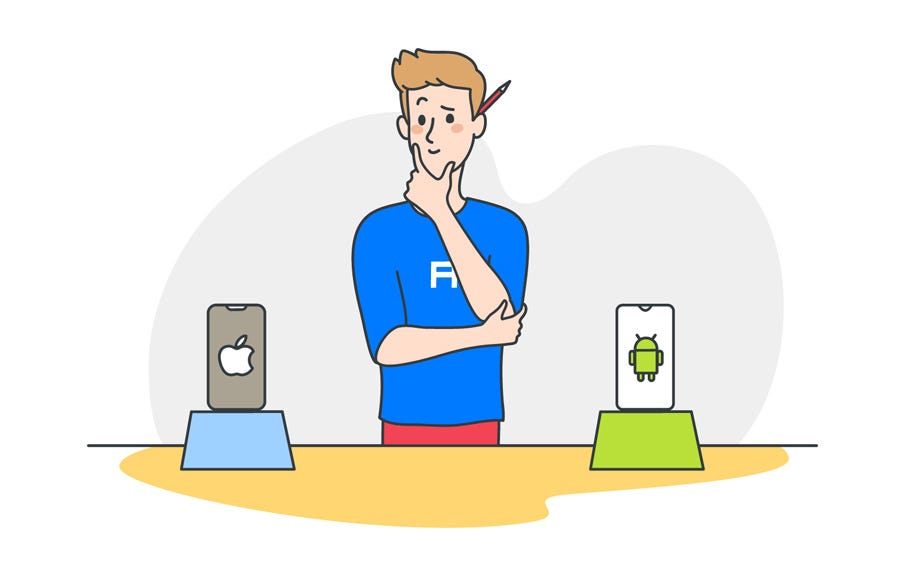
Adapting an app's design to another platform is crucial. But what exactly sets design for iOS and Android apart? Let's see.
![]()

This article has been written by Artur Abrarov from Redmadrobot . Translated and reposted with permission by Alconost Inc., professional translation and localization company.
Adapting an app's design to another platform is an inextricable part of a mobile app designer's job. The goal of this process is to organically integrate the app's design into the user's patterns for interacting with the target platform. In addition, adaptation simplifies development because it makes it possible to use the platform's native components.
In order to adapt an a p p's design properly, you need to follow the platform's guidelines, i.e. the Human Interface Guidelines (HIG) for iOS and Material Design for Android. You also need to communicate with the developers, ideally getting them involved in the design process as early as possible so they can immediately establish technical restrictions.
But what exactly sets design for iOS and Android apart? In this article, I'm going to discuss 32 specific design differences between iOS and Android. They're divided into four groups: basic differences, differences in navigation and patterns (UX), differences in components (UI), and miscellaneous differences.
iOS's features will appear on the left, and Android's will appear on the right.
Basic Differences
1. Human Interface Guidelines vs. Material Design
Almost all the differences in this article are taken from an analysis of these guidelines. On the conceptual level, we can boil them down to the following: HIG is all about flat, light, friendly design, and it comes from a gradual rejection of skeuomorphism. Material has a number of foundational principles: material as a metaphor; bold, graphical, conscious; intentional animation; flexible foundation and cross-platform functionality. If you aren't familiar with the guidelines, I suggest reading them through before continuing with this article.


2. Units of measurement: pt vs. dp
iOS app designs are developed in pt, and Android app designs are developed in dp. As a rule, we develop designs in 1x (or mdpi) and upload them to Zeplin. Zeplin displays iOS designs in pt and generates icons and illustrations in 2x and 3x. For Android, designs are displayed in dp and generate graphics in hdpi, xhdpi, xxhdpi, and xxxhdpi.


3. Screen size: 320pt x 568pt vs. 360dp x 640dp
I prefer designing iOS apps in the lowest possible size: the iPhone 5 SE's screen size of 320pt х 568pt. I do this to avoid having content display incorrectly on small screens. Some people prefer designing for iPhone 8.
For Android apps, we have a generally accepted screen size of 360dp х 640dp.
When designing for iOS, I sometimes develop designs for iPhone X (375pt х 812 pt). This is necessary for the developer to understand how to set the margins properly on a screen of this size. When designing for iPhone X, you also need to keep the Safe Area in mind. This is the only area in which you should place content.

4. System font: San Francisco vs. Roboto
If you don't know which font to use, use the system font. For iOS, this is San Francisco. For Android, it's Roboto.


5. The Android Navigation Bar
Unlike iOS, Android has a built-in tool for reverse navigation. This is the Android Navigation Bar.

It is either physically built into the smartphone or part of the interface. The user can use the arrow to move one step backward chronologically (reverse chronological navigation). Navigation occurs the same way within an app or between apps.
When I was just starting out as a mobile app designer I spent a lot of time tormenting Android developers with the question "why do we need two back buttons?" There's one in the Navigation Bar at the bottom and one in the Top App Bar when you switch to a daughter page.
Well, here's the answer. There are two different kinds of reverse navigation: reverse chronological navigation (performed using the back arrow in the Navigation Bar; we call it "back")

and upward navigation (performed using the arrow at the top of the screen; we call it "up").

Imagine we have a path with points A, B, and C, where A is the mother page and B and C are the daughter pages. Now imagine the user goes from A right to C. If they press the back button, they'll go back to A, but if they press the up button, they'll go to B, and a second press will take them back to A.
This is difficult to implement and confusing for the user, so now these two buttons both do the same thing: they take the user "back," just like on iOS. In other words, if the user goes to C from A, it will take them back to A.
6. The importance of elevation in Material
In principle, iOS has no shadows. As an exception, shadows can be found on the main screen of the App Store and in Health. But all in all, the HIG do not provide for the use of shadows in any way.
In Material, shadows play a large role. They add a third dimension (Z axis) to the interface, which enables every component to have its own specific location along this axis (from 0dp to 24dp). Moreover, this Z axis doesn't just exist on the conceptual level — developers have an "elevation" parameter they can use to set the position of elements along this axis.

Navigation and state changes are accompanied by changes in the components' elevation. So when designing for Android, we need to take a conscious approach to creating shadows.
7. Differences in naming
There are a lot of differences when it comes to naming. Let's take a look at five of them.
а) Tab Bar vs. Bottom Navigation Bar
This is a bar for top-level navigation within the app. It is statically located at the bottom of the screen on both platforms. In addition to naming, the bars are distinct in terms of their behavior. We'll take a closer look at this a little later.


b) Navigation Bar vs. Top App Bar
This bar does more or less the same thing on both platforms: it tells the user their current position within the app, allows them to go back to the previous screen, and suggests one or more contextual actions. We'll talk more about these differences later in the article.


c) Segmented Controls vs. Tabs
In addition to naming, Android tabs have a number of different features: you can swipe to move from tab to tab, and Material permits us to use them for top-level navigation.


d) Alerts vs. Dialogs
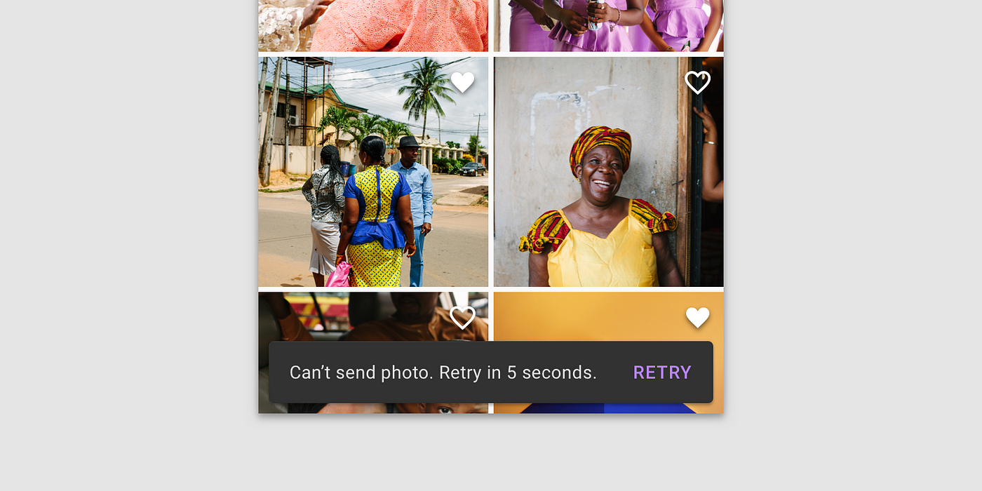
Interestingly, only one tool for alerting the user is described for iOS: Alerts. On Android, we have three of them: Snackbars, Banners, and Dialogs. Snackbars are intended for low-priority messages and do not require any action. Dialogs block interaction with the interface and require the user to perform an action. Banners halfway between these two — they do not block interaction, but they do require the user to perform an action.


e) Touch ID vs. Android Fingerprint
This is just one example of the different naming conventions for the technologies used on these platforms. You need to know them, since, in addition to naming, they have a number of distinctions in terms of the technical features of their implementation. Understanding naming distinctions is the first step toward understanding technological distinctions.


Differences in Navigation and Patterns (UX)
8. Methods of top-level navigation
Let's start at the very top. iOS only recommends one method of top-level navigation: via the Tab Bar. On the other hand, Android has three methods: the Navigation Drawer, the Bottom Navigation Bar, and Tabs.

If there are more than five top-level pages, we use the Navigation Drawer. If there are fewer, we use the Bottom Navigation Bar. Tabs aren't used for this kind of navigation very often, but this method is also available. However, Material recommends not combining Tabs and the Bottom Navigation Bar because interacting with these components affects the content of the page and the user can get confused.
9. Differences in the behavior of the Tab Bar and the Bottom Navigation Bar
This difference is suggested by Material.
On iOS, if you go from a mother page to a daughter page, then go to another mother page via the Tab Bar, if you go back to the first mother page, you'll still be on a daughter page. Everything is much stricter on Android — if you transition via the Bottom Navigation Bar, you'll always move between mother pages. If you were on a daughter page before this, it will be reset.
Our Android developers are convinced that Android's behavior is incorrect in this regard. If the user transitions via the Bottom Navigation Bar, it should save the open daughter pages like on iOS.
10. Special behavior of tabs on Android
Unlike Segmented Controls on iOS, Android's tabs have a special feature: you can move from tab to tab by swiping right and left.
This is because the tabs' pages are on the same elevation.
It's important to know this because, when using tabs on Android, we shouldn't add elements with similar gestures (for example, a carousel of pictures or interacting with maps using swipes) to the design.
In general, these two components are not fully interchangeable. Segmented Control is a control method that controls page content. Tabs are a navigational tool. So you should talk to the developers before viewing these components as equivalent during adaptation. Sometimes it can be more correct to replace Android's tabs with Page Control. It all depends on the context.
11. Differences in the behavior of daughter pages
On iOS, daughter pages (not counting modal windows) only appear in one way: the daughter page appears to the right and on top of the mother page with a "slide in" effect. Returning to the mother page occurs with a "slide out" effect.
Material recommends showing the user the hierarchical interconnection between the mother and daughter pages using an intentional animation.
The component the user interacts with to transition to the daughter page opens and covers the mother page. This way the user understands where they are and where they came from, as well as why this happened and where they will go if they press the back button. This transition occurs using Standard Easing.
12. Special pattern for calling up the Navigation Drawer
When designing an app with a Navigation Drawer it's important to remember that this component "takes over" the "edge swipe left to right" gesture. So don't add any other logic to this gesture.
On iOS, this gesture has a conventional pattern of transitioning from a daughter page to the mother page. This pattern has gradually made its way to many Android apps as well.
13. The behavior of content during scrolling
According to the HIG, content on iOS behaves the following way during scrolling: the Navigation Bar is reduced in width, and the Toolbar disappears. But in general, iOS developers can configure any kind of behavior for content and bars during scrolling.

Material suggests more options for behavior during scrolling. For example, the Bottom Navigation Bar, Search Bar, and Bottom App Bar can disappear during scrolling.
The Top App Bar can also disappear or move above the primary content.
14. Different search behavior
Interestingly, the HIG relegate searching to bars and call it a Search Bar. In Material, we find searching in the Navigation section, not the Components section. In other words, for Material, search is just another navigation method. On both iOS and Android, search can be statically present on the screen, and, as a rule, it's fixed to the Navigation Bar/Top App Bar.

On both platforms, search can appear in the form of an icon, but on iOS the icon expands into the independent Search Bar component, and on Android it expands within the Top App Bar.
One feature of search on iOS is that it can be "hidden" underneath the Navigation Bar and called up with a "swipe down" gesture. The same gesture is typical for refreshing (pull to refresh), so you don't want to activate search and refresh using the same action.
Differences in Components (UI)
15. Which components are absent on iOS
Many of Android's native components are absent on iOS. Let's run through them.
a) Navigation Drawer
In principle, iOS does not recognize burger menus. As we mentioned earlier, iOS only has top-level navigation via the Tab Bar.

b) Backdrops
Backdrops are, as far as I'm concerned, the most amazing component in Material. As of the writing of this article, Android is still just planning to implement backdrops as a native component. In general, when examining Material's components, check whether they are available for use yet or not.
The material itself loves this component. For example, just look at the winners of the Material Design Award 2019.
c) Banners
Banners are not among iOS's native components. Using a banner, we can communicate important information to the user and suggest actions connected to it.

d) Snackbars
Like banners, Snackbars are not native to iOS. Snackbars are used to give the user brief messages about the results of their actions.

e) Chips
Chips aren't native iOS components either. They are used for information entry, descriptions, and actions.

f) Bottom App Bar
In this case, we can argue that iOS has a component that is similar to the Toolbar. But they're actually different, and here's why: a Toolbar is a bar for contextual actions. For example, when editing a list of messages in Messages, a Toolbar appears with the actions "Read all" and "Delete." On the other hand, the Bottom App Bar is essentially just a Top App Bar that has been moved down along with the same top-level actions, including opening the Navigation Drawer, calling up search, etc. We can also put a FAB in the Bottom App Bar.

g) FABs
No, there are no FABs in iOS either. A FAB is a button for performing the primary action on the screen. For example, in an email app, the FAB will compose a new email.

If you use a FAB for the primary action on the screen in Android, on iOS the primary action should be located at the top, on the right side of the Navigation Bar (see iMessages, for example).

h) Bottom Navigation Drawer
This is another version of the Navigation Drawer that is typical for Android. It is called up by pressing the burger menu button in the Bottom App Bar.
i) Side Sheet
Although Material also permits the use of this component in mobile apps, I'd recommend replacing it with a more familiar Bottom Sheet.

j) Expanding Bottom Sheet
This very nice-looking Android component is not one of iOS's native components. An Expanding Bottom Sheet is a surface attached to the bottom of a page. If the user taps this surface, it expands into a full-fledged page.
k) Standard Bottom Sheet
A Standard Bottom Sheet is a variation of the Bottom Sheet, and it is not an iOS component.

16. Which components are absent on Android
Now let's take a look at which components cannot be found in the Android library.
a) Page Control
Page Control shows which page the user is on. It is not a native Android component.

b) Toolbars
Toolbars are only seen on iOS.

с) Steppers
Steppers are a standard iOS control that is not described in Material. We use them to enter small values such as the number of copies when printing.

d) Popovers
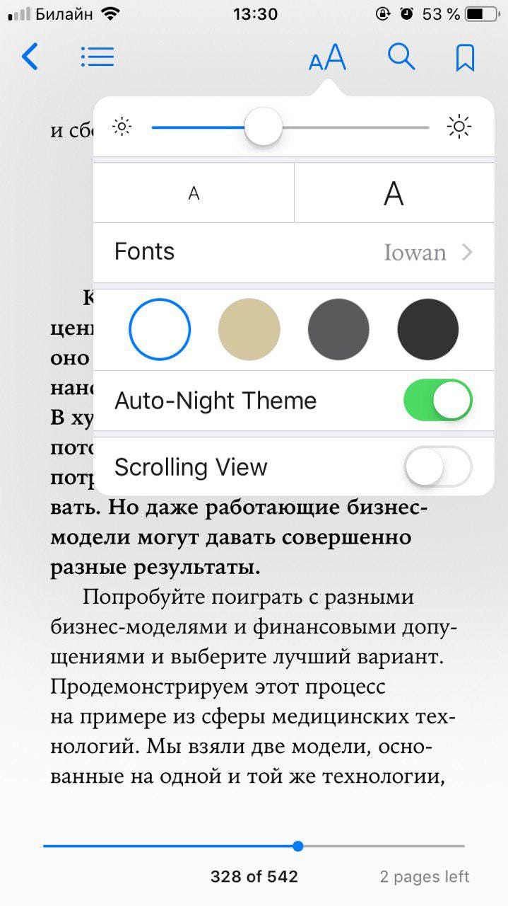
A Popover is a popup panel that is used primarily on iPad.

There is one standard application for Popovers on iOS: adjusting text settings in readers or browsers.

17. Different Status Bars
The Status Bar performs the same function on both platforms: it shows the time, battery level, and mobile and Wi-Fi connection levels. These indicators are in different places within the Status Bars, and their general visual styles are also distinct.


The Android Status Bar also has a special feature: when an app sends the user a notification, its icon appears in the Status Bar. There's nothing like this in iOS.
18. Refresh Content Control vs. Swipe to refresh
Refresh is activated via the same "swipe down" gesture on both platforms. However, on iOS Refresh Content Control "bumps" other content downward, whereas Swipe to Refresh moves content up on Android. In addition, iOS's refresh disappears when content scrolls, but on Android it remains visible.
19. Different controls
The only differences between the platforms' controls are visual. It's worth noting that controls are simpler on iOS — checkmarks are used for both radio buttons and checkboxes. These controls have different shapes on Android.


Material also suggests using parent checkboxes when you need to give the user the ability to quickly select all options.

20. Different back arrow appearance and header position
On iOS, the arrow doesn't have a line in the middle of it because on iOS the back arrow is drawn by the previous screen. If the header on the last screen was standard, the header moves left toward the arrow. If the header was wide, it moves up. If the name of the previous page is too long, it is replaced by the word "back."


21. Different appearance of "three dots" icon
This difference doesn't appear to be based on anything concrete. We'll give the platform its due and use the recommended orientation for the three dots. The dots are horizontal on iOS and vertical on Android.


22. Different appearance of Pickers
On iOS, date selection is done using a drum. iOS's drums can also be used for entering any other information. On Android, date Pickers imitate the appearance of a physical calendar.
Material also recommends giving users the option to enter dates using an Input Field.
23. Different Text Fields
The HIG are much less demanding than Material when it comes to Text Fields.
Differences
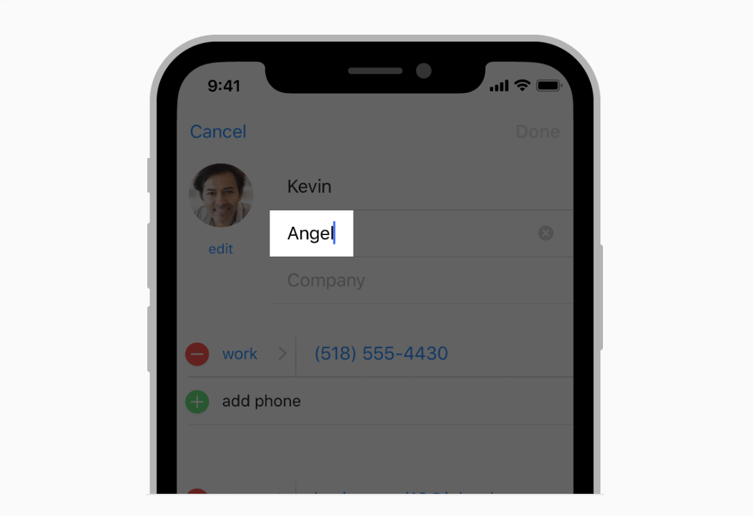
On iOS, Labels are located within the entry field and disappear while the text is being entered. Material recommends moving Labels up while the text is being entered.

Similarity
Both platforms suggest adding a Clear Button when necessary.
What else Material requests
Material also recommends highlighting a Label and the bar under the Text Field in a primary color. This helps the user understand that the field is highlighted. Material describes the field's behavior when a mistake is made during entry. There are two shapes to choose from in Material: Filled and Outlined.

24. Context Menus vs. Menus
Context Menus appeared in iOS 13. This control offers the user several contextual actions connected to the selected elements. There is an Android element that is somewhat similar to it: Menus.


Android Menus are used in the majority of cases — they suggest contextual actions for both the selected element and the entire page as a whole, they are used as an input with multiple options to choose from (drop-down menus), and they are used for editing text. Context Menus are only an iOS component. But Android Menus can be used in mobile or desktop apps.
25. Action View/Activity View vs. Modal Bottom Sheet
If you use an Action View or Activity View on iOS, on Android it can be partially replaced by Android's Modal Bottom Sheet component. It also appears in the bottom part of the screen, darkens content, and is closed in similar ways (a button, tapping outside the modal window, or sometimes swiping down). The component's goal is to offer a choice or contextual actions.
26. Edit Menus vs. Text Selection Toolbar
In addition to the visual differences between Edit Menus and Text Selection Toolbars, they also have this difference: the user can continue highlighting text by tapping and holding on Android. On iOS, a magnifying glass appears for precisely selecting a place in a word following a tap and hold.

Android is also different from iOS in that, when additional actions are called up, the Text Selection Toolbar becomes a Menu.
27. Different divider size
On iOS, it's 0.5pt. On Android, it's 1dp.
Other differences
28. Different requirements for tap zone size
According to the guidelines, the minimum tap zone size is 44x44pt on iOS and 48x48dp on Android.
29. App Store vs. Google Play
Your iOS app will be downloaded from the App Store. Your Android app will be downloaded from Google Play. To make sure your app is published properly in these stores, you need to adhere to their requirements. The App Store's requirements can be found here, and Google Play's can be found here. There are a lot of requirements there, so I recommend studying them prior to release.
30. Special pattern on iOS: Undo and Redo
There is a special pattern on iOS: if the user shakes their smartphone, the app gives them the option to cancel or redo their last action. As a rule, this gesture is used to undo typing.

31. Attitude toward Branded Launches
Material permits placing the app's logo on the Launch Screen. The HIG do not recommend using the Launch Screen for marketing purposes and suggest only showing a Placeholder while the app is launching.
Knowing the guidelines increases our awareness. This helps us understand established user patterns and create apps that fit organically into the user's habits.
The guidelines motivate us to respect the platforms' native solutions. When adapting a design to another platform, there is always a temptation to duplicate the design without making any changes. This harms the user experience and makes development more difficult. But if we are aware of the differences between native solutions, we can adapt our design properly.
And if we want to implement a new custom solution, knowing the guidelines helps us make the case for innovation.
In the end, knowing the guidelines and their differences is an important skill for a mobile app designer to have.
Which other differences are you aware of? Share them in the comments below.
Ios & Android Mobile App Design And Development
Source: https://uxdesign.cc/ios-vs-android-design-630340a73ee6
Posted by: thompsonstions.blogspot.com

0 Response to "Ios & Android Mobile App Design And Development"
Post a Comment